Well, the day has FINALLY come!! Welcome to the new and improved Mary Costa Photography blog! If you happened to stumble over here in the last couple of weeks you might have noticed a big change, but today it’s official. I’ve been dreaming of this day for so long that it doesn’t actually feel real to me! That might be a little dramatic, but it’s the truth.
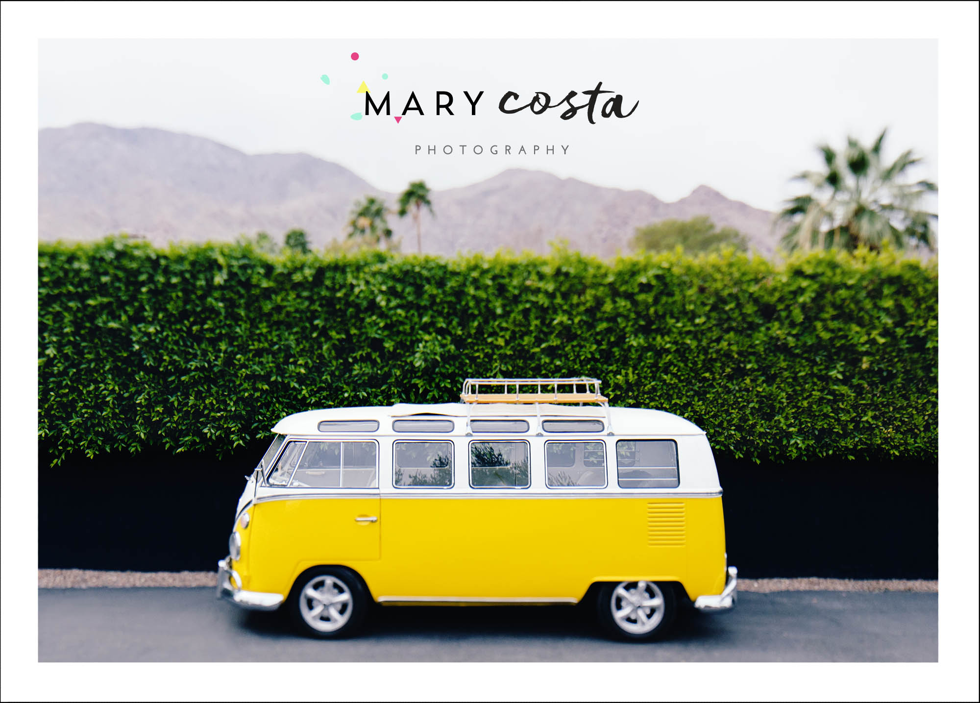
I’ve been wanting to do a major update to my site for the last couple of years, especially since my old site didn’t include any lifestyle, interior, or food photography. Enter: graphic designer, Kati Forner. Kati found me on Instagram and contacted me out of the blue. It was meant to be! I cannot rave about her enough. Not only is she incredibly talented, but she’s also very kind, intuitive, and always on her A-game. I had so much fun working with her on this re-branding and thought I would share a bit about the process here! To kick it off, here are some final products, starting with one of my many photo postcards. Anyone want some snail mail?
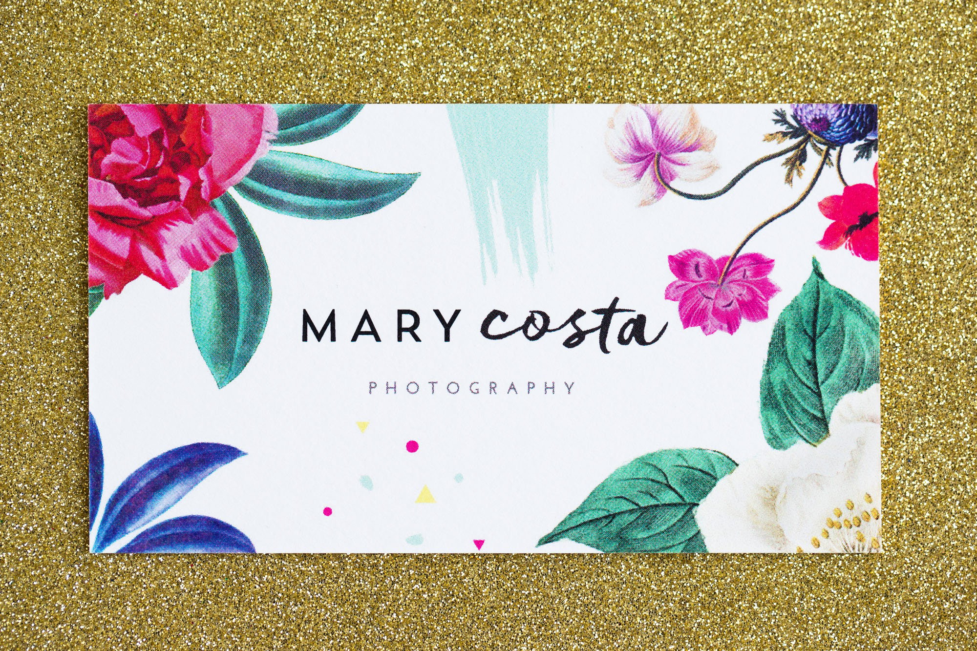
 My new business card:
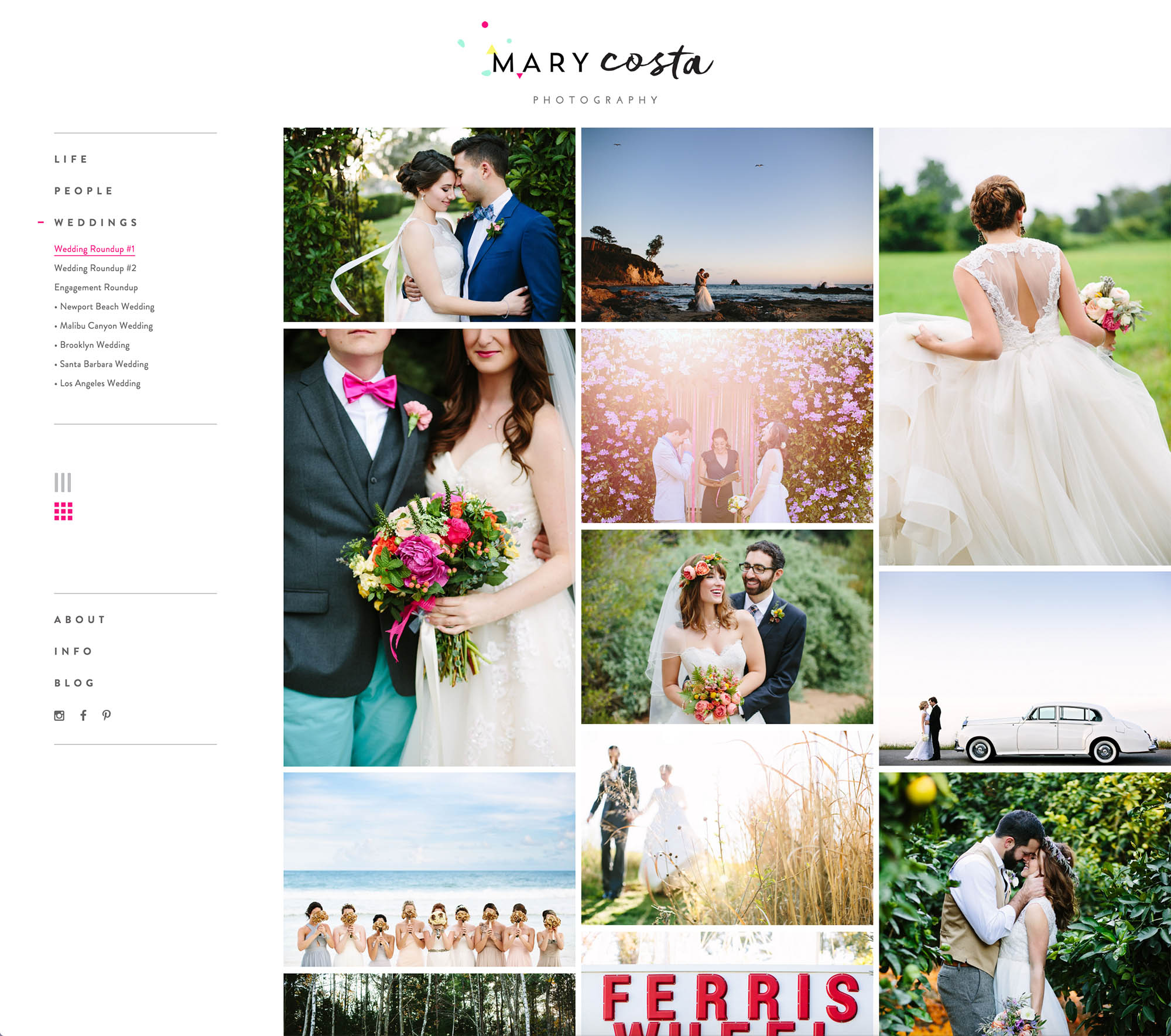
Ta-da! A screenshot of one of the MANY galleries on the NEW WEBSITE. Once the site loads in the horizontal scroll mode you have the option of seeing thumbnails by clicking the icon with nine little squares on the left! The website was developed by the sweet guys over at Codeless Interactive!
 I debated about posting these (am I giving away too much??) but I LOVE when people show the behind-the-scenes on their re-branding, so I figured I should share the wealth. Kati, being the graphic design rockstar that she is, came up with six different branding ideas in the initial treatment. These two were my faves. The one on the left was a little too muted for my taste, and the right was a little too sophisticated for my whimsical side.
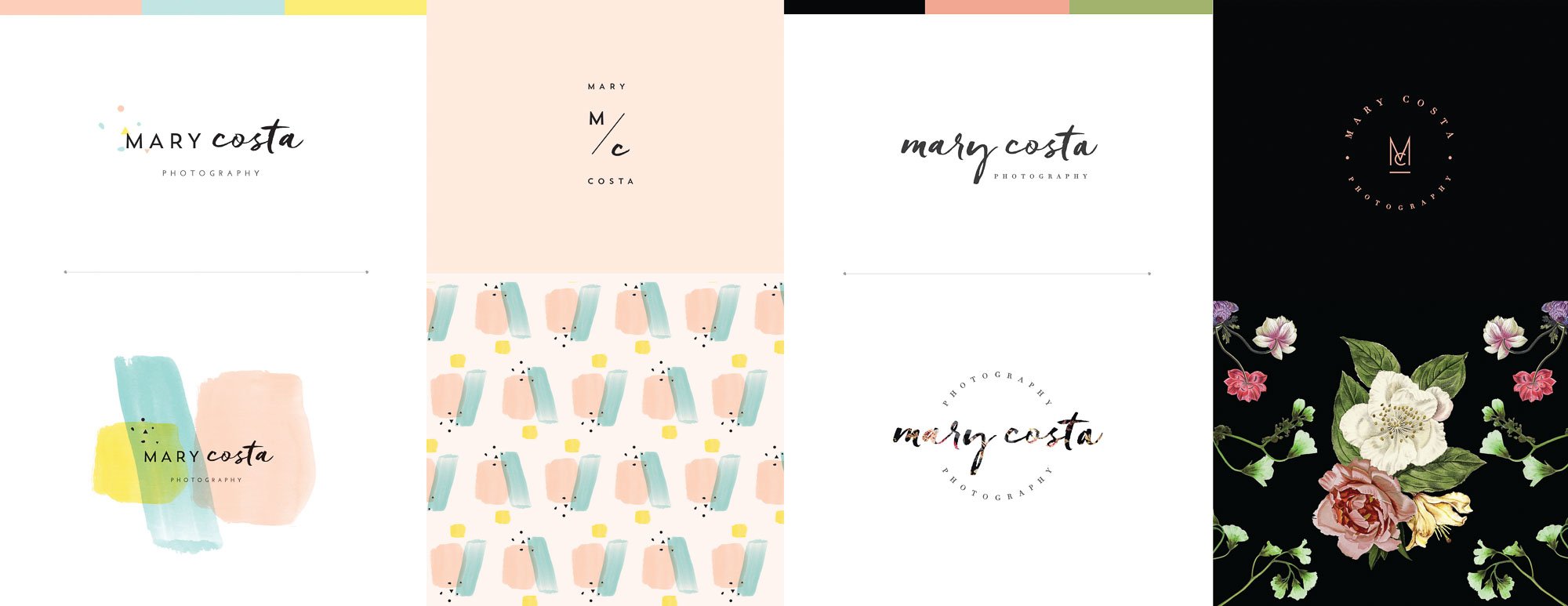
Next round! I really had trouble deciding between these two. I loved the bright colors on the left but have an endless passion for florals, so I was very torn…!
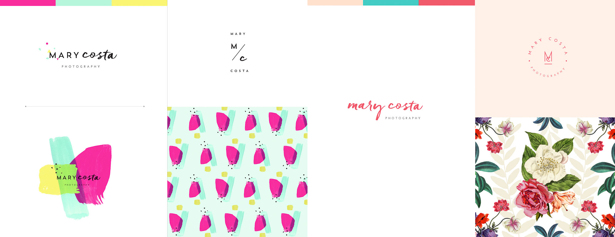
The final product! We’ve got confetti! We’ve got flowers! We’ve got watercolor swooshes!
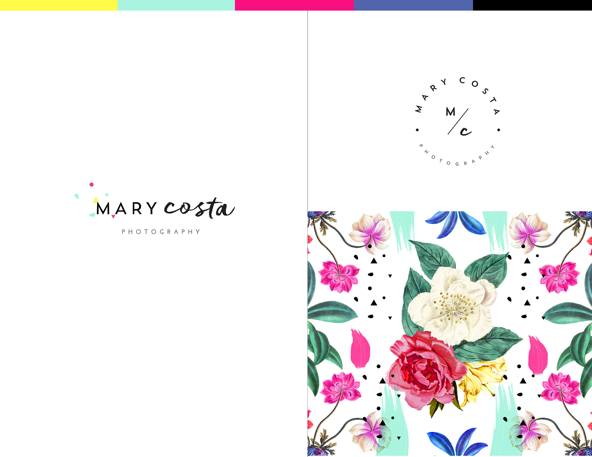
Kati has taken elements from that wild patten above and has put them together in some fun ways! I love this header for the back of my postcards:

So there you have it! I feel like this brand is so true to my personality and my business, and I couldn’t be happier with the result. Please feel free to take some time to look at the new website (I recommend looking at it on a bigger screen for optimal photo enjoyment)!
Thank you, thank you, thank you to Kati and to Eric and Jeff over at Codeless Interactive for making this dream a reality. Thank you, also, to Megan, Jess, Molly, Jennie, Ana, and Jeff H. for giving me such awesome feedback throughout this process. Thank you to my amazing parents, Trudi and Ed, for always listening and for providing their endless support even from all the way across the country. And most importantly, an endless thank you to my love, Mike, for being my sounding board and for caring about this process just as much as I have. He spent countless hours going through photos, listening to my ideas, and testing things with me, and I’m eternally grateful!
Happy Friday!!

1 Comment | Show Some Love